How to Create a Product Warning Label for Global Markets?

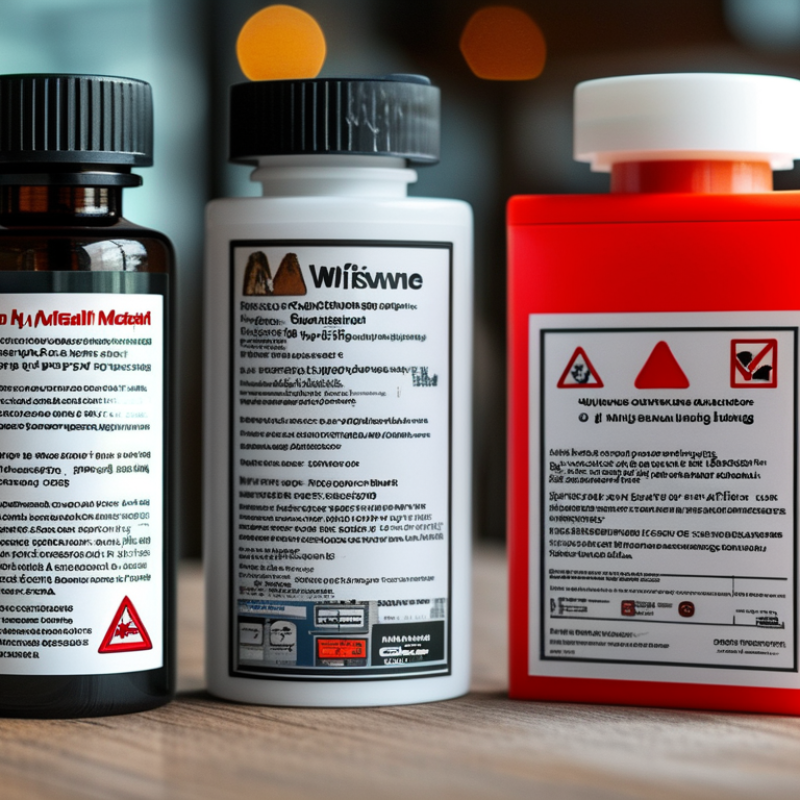
Creating a product warning label for global markets is not a simple translation exercise. It is a risk-communication task shaped by language, culture, product use, and human attention. A label may appear beside a hot surface, inside a child-resistant package, or on a small electronic device. Each setting changes what users notice first.

Warning-science expert Michael S. Wogalter explains, “A warning is a communication that is intended to inform people about a hazard and influence their behavior.” This principle should guide every product warning label. The message must identify the danger, describe the possible harm, and show a clear action. Short phrases often work best. Strong contrast helps. Familiar symbols can support, but not replace, understandable words.

Global design requires careful research. Test translations with native speakers, not only software. Check whether colors, gestures, symbols, and reading direction remain clear in each target market. A red triangle may suggest danger in one place, yet carry a different meaning elsewhere. Place the warning where users will see it before contact with the hazard. That detail is easy to miss.

No label can solve every safety problem. Product design, instructions, packaging, and training must support it. Even experienced teams make assumptions. User testing may reveal that a bold warning is ignored, misunderstood, or noticed too late. That uncomfortable result is useful. It shows where the label needs improvement before the product reaches people worldwide.

How to Create a Product Warning Label for Global Markets?

Define the Purpose and Scope of the Product Warning Label

A global product warning label begins with a clear purpose. It should identify a realistic hazard, explain likely consequences, and guide safe action. Do not treat the label as decoration. A hurried user may read it beside a machine, bottle, or electrical device. Use direct language that works during a stressful moment. For example, “Keep hands away from moving parts” is more useful than “Handle with care.” Define who needs the warning, including operators, installers, caregivers, and children nearby. I have found that vague audiences create vague instructions. That weakness deserves review.

Tips: Write the warning after observing actual use. Note where people stand, what they touch, and what they might misunderstand. Set a scope boundary. The label may cover physical injury, storage, cleaning, or disposal, but it should not carry every instruction. Separate warnings from operating steps. Check whether a symbol supports the words. Symbols can confuse users across cultures.

For global markets, define the scope by product version, environment, and user profile. A warning for indoor equipment may fail in a humid outdoor setting. Record the conditions that trigger the hazard, such as heat, pressure, sharp edges, or unstable placement. Then match each condition with one action. “Unplug before cleaning” is specific and testable. Confirm translations with qualified reviewers and test the label with people unfamiliar with the product. Their hesitation can reveal missing context. Perfect clarity is difficult; uncontrolled ambiguity is avoidable.

Identify Global Safety Requirements and Target Market Regulations

How to Create a Product Warning Label for Global Markets?

Identify Global Safety Requirements and Target Market Regulations

A global warning label begins with market-specific research, not translation. Regulations differ in wording, symbols, font sizes, and importer information. The European Commission’s Safety Gate 2023 report recorded 3,412 product safety alerts. Many involved missing or inadequate warnings. Labels are evidence.

Map each destination before final artwork. Check the EU General Product Safety Regulation, U.S. consumer product rules, Canada’s CCPSA, and applicable national standards. ISO 3864-2 provides guidance for safety symbols and their application. Local language requirements also matter. A warning that works in English may fail in Poland, Japan, or Brazil. Translation is not enough.

Use a compliance matrix with four columns: hazard, required wording, symbol, and market owner. Add batch codes, manufacturer details, and traceability information where required. Test the label on the actual package. A small warning under a curved seam can become unreadable. The WHO Global Status Report on Road Safety 2023 estimates 1.19 million annual road deaths, reminding designers that visibility and comprehension have practical consequences. Still, this comparison is imperfect; product labels cannot solve every safety risk. Reviewers should question color choices, reading distance, and cultural interpretation. A red triangle may attract attention, but it does not guarantee understanding.

Write Clear, Accurate, and Translatable Warning Content

How to Create a Product Warning Label for Global Markets?

Write Clear, Accurate, and Translatable Warning Content

A global warning label must be clear before it becomes multilingual. Use short sentences, familiar verbs, and specific actions. “Keep away from heat” is stronger than “Handle with care.” Small errors matter. CSA Research’s 2020 report found that 65% of consumers prefer content in their own language, while 40% will not buy from companies lacking localized information. Translation quality therefore affects both safety and trust. Follow ISO 3864-2 for safety-label design and ISO 7010 when selecting standardized safety symbols. Text and symbols should communicate the same risk.

Describe the hazard, possible consequence, and required action. For example: “Hot surface. Avoid contact. Allow 30 minutes to cool.” Keep one instruction per sentence. Avoid idioms, humor, abbreviations, and culturally specific references. A local language reviewer should check every version, including warnings translated from English. Back-translation can expose missing details, but it is not perfect. A technically correct sentence may still sound unnatural to users. The World Health Organization’s World Report on Vision estimates that at least 2.2 billion people have vision impairment. Use readable type, strong contrast, and more than color alone. Provide accessible alternatives where practical.

Tips: Build a controlled vocabulary before translation. Define terms such as “warning,” “danger,” and “caution.” Test the label with people unfamiliar with the product. Ask them what could happen and what action they would take. If answers differ, revise the wording. Keep evidence of reviews, test results, and approval dates. That record supports reliable updates when products or markets change.

Design Symbols, Layout, and Language for International Users

A global product warning label must work before a user reads every word. Symbols, layout, and language should support one another. ISO 7010 provides registered safety signs for hazards, prohibitions, and mandatory actions. ISO 3864 also guides colors, shapes, and contrast. These standards create a useful visual foundation, but they do not solve every cultural problem.

Start with a symbol that remains clear at thumbnail size. Place the hazard symbol beside the short warning, not beneath distant instructions. Use strong contrast, generous spacing, and a predictable reading direction. A red border may signal danger in many markets, yet color meanings can vary. Test printed labels under dim warehouse lighting and glare. Small text fails quickly.

Language still matters. CSA Research reported in its 2020 “Can’t Read, Won’t Buy” study that 76% of consumers prefer product information in their own language. The report also found that 40% would not buy from websites in other languages. Translate warnings through qualified reviewers, then test them with local users. Literal translation can sound strange or weaken urgency. Keep the action visible: “Keep away from heat” is clearer than a dense technical paragraph. Include measurement units, emergency instructions, and legally required local wording. A label may look correct on screen but become crowded after translation. That failure is easy to miss. Conduct readability checks, reverse translation, and hands-on packaging trials before release.

How to Create a Product Warning Label for Global Markets? - Design Symbols, Layout, and Language for International Users

Global Product Warning Label Planning Matrix
Market or System Main Regulatory Framework Required or Common Symbols Signal Words Language Considerations Core Label Elements Layout and Design Guidance
Globally Harmonized System (GHS) United Nations GHS model framework, implemented through national or regional legislation. Nine red-bordered diamond pictograms may be used for physical, health, and environmental hazards. Not every hazard class requires a pictogram. “Danger” for more severe hazard categories and “Warning” for less severe categories. Use the official language or languages required by the destination jurisdiction. Translated text should retain the approved hazard meaning. Product identifier, signal word, hazard statements, precautionary statements, supplier information, and applicable pictograms. Keep pictograms highly visible, use strong contrast, group related information, and avoid placing critical text over complex graphics.
European Union and European Economic Area Regulation (EC) No. 1272/2008 on classification, labelling and packaging of substances and mixtures, commonly known as the CLP Regulation. CLP hazard pictograms in red-bordered diamonds, selected according to the product’s classified hazards. “Danger” or “Warning,” where assigned by the applicable hazard category. Labels must be provided in the official language or languages of the member state where the product is placed on the market. Product identifier, supplier details, nominal quantity for certain consumer packages, pictograms, signal word, hazard statements, precautionary statements, and applicable supplemental information. Certain hazardous mixtures may require a Unique Formula Identifier. Place the product identifier and primary hazard information together. Ensure the label remains legible after normal handling, storage, and transport.
United States Occupational Safety and Health Administration Hazard Communication Standard, 29 CFR 1910.1200, aligned with GHS principles. Applicable GHS pictograms shown as black symbols on white backgrounds with red borders. “Danger” or “Warning,” when required by the hazard classification. English is required for federal OSHA compliance. Additional languages can be added, provided the required information remains complete and consistent. Product identifier, signal word, hazard statements, precautionary statements, pictograms, and the responsible party’s name, U.S. address, and telephone number. Use a clear hierarchy: product name first, hazard prominence second, instructions third, and contact information last. Do not dilute mandatory text with decorative content.
Canada Workplace Hazardous Materials Information System (WHMIS) 2015, implemented through the Hazardous Products Regulations. GHS-based pictograms in red-bordered diamonds, selected according to the product classification. “Danger” or “Warning,” as determined by the hazard category. Labels and safety data sheets generally need English and French versions. Both languages must communicate equivalent information. Product identifier, initial supplier identifier, pictograms, signal word, hazard statements, and precautionary statements. Use parallel bilingual blocks or carefully separated language sections. Maintain the same emphasis, order, and warning strength in both languages.
Australia Work Health and Safety hazardous chemical requirements, based on the seventh revised edition of the GHS. GHS pictograms in red-bordered diamonds for applicable hazard classes. “Danger” or “Warning,” according to classification. Labels for workplace hazardous chemicals should be in English and use terminology accepted under Australian requirements. Product identifier, supplier details, pictograms, signal word, hazard statements, precautionary statements, and applicable supplemental information. Allow enough space for English hazard and precautionary statements. Avoid relying on color alone because labels must remain understandable in low light or for users with color-vision deficiency.
Japan Japanese Industrial Standards for GHS communication, including JIS Z 7253, together with applicable national chemical regulations. GHS pictograms in red-bordered diamonds where required by the classification. Japanese equivalents of “Danger” or “Warning,” based on the applicable classification. Use Japanese for the domestic market. Professional translation is important because small wording changes can alter the legal meaning of a hazard statement. Product name or identifier, supplier information, pictograms, signal word, hazard statements, precautionary statements, and required regulatory information. Use generous line spacing and sufficient character size for Japanese text. Confirm that the layout remains readable when horizontal and vertical writing conventions are considered.
China National standards in the GB 30000 series and related Chinese requirements for classification, labelling, and safety data communication. GHS-style red-bordered diamond pictograms for applicable hazards. Chinese signal words corresponding to “Danger” or “Warning,” as applicable. Simplified Chinese is generally used for products marketed in mainland China. The translation should be checked against current Chinese terminology and standards. Product identifier, supplier information, hazard pictograms, signal word, hazard statements, precautionary statements, and applicable physical or chemical information. Keep Chinese text visually separate from other languages. Use high contrast and avoid shrinking the translated text below a practical reading size.
International Transport of Dangerous Goods United Nations Recommendations on the Transport of Dangerous Goods, Model Regulations, implemented through modal transport rules. Transport hazard labels, handling marks, marine pollutant marks where applicable, and other prescribed marks or placards. Transport marks generally rely on hazard classes, symbols, and prescribed text rather than consumer-style signal words. Use the language and documentation format required by the transport mode and destination. Standardized symbols are especially important for cross-border shipments. Proper shipping name, UN number, hazard class or division, packing group where applicable, handling marks, and required emergency or transport information. Place transport marks on visible exterior surfaces, keep them unobstructed, and ensure they remain durable during handling, weather exposure, and vibration.
Universal Design Controls Best-practice design controls that support regulatory compliance and user comprehension across markets. Use standardized pictograms only. Do not replace mandatory hazard symbols with custom icons or illustrations. Use one approved signal word for the applicable classification and avoid adding an unofficial second warning level. Create a controlled translation workflow, maintain a terminology database, and review every localized version with a qualified regulatory specialist. Include only verified hazard, precautionary, product, supplier, and regulatory information. Keep label content consistent with the current safety data sheet. Use a strong information hierarchy, adequate white space, durable materials, readable type, high contrast, and redundant communication through text and symbols. Validate the final label at its actual printed size.
Compliance note: Regulatory requirements can vary by product type, hazard classification, container size, use environment, transport mode, and jurisdiction. Confirm the final label against the current laws, standards, and official guidance in every target market before production.

Review, Test, and Maintain the Warning Label Across Markets

A global product warning label is not finished when the artwork is approved. It must survive review, testing, and repeated market changes. Start with a country-by-country requirements matrix. Record language, hazard wording, symbols, signal words, size, placement, and required contacts. Ask regulatory specialists and native-language reviewers to examine every version. A direct translation may sound accurate but still feel unnatural. That gap can affect comprehension.

Test the label with realistic users, not only internal staff. Print samples at final size and place them on the product under normal lighting. Check whether a user can find the warning within five seconds. Use short comprehension interviews and observe where people hesitate. Test color contrast, font size, folding, moisture, abrasion, and online versions.

One early test may expose a crowded panel or a confusing symbol. That happened in our review. The layout looked balanced, but the critical instruction disappeared beside the barcode.

Maintain a controlled master file and a change log for every market. Set review dates after regulatory updates, product changes, complaints, and field observations. Keep approved translations, test evidence, artwork files, and sign-offs together. A local reviewer should confirm that revised wording remains culturally clear. Do not assume one successful test proves permanent clarity. Users change. Packaging changes too. We still leave room for doubt, because a perfect label on paper can fail in a busy home, workshop, or warehouse.

Get an Instant Quote

Share Your Feedback